When capturing the clips we had filmed we went onto Adobe Premiere and recorded the whole clip onto the computer. Therefore when going through the film we could cut out any clips we did not need using the cut button on the editing keyboard.
Due to the different clips we had incorporated we did not stick solely to the pre production storyboard and in fact used a variety of different shots that had not been included at first. Therefore we improved our fiction film based on our filming which we pieced together when editing. There were some bits of the storyboard we left out whilst editing. This is because the shots did not go well together and we wanted our clips to flow easily together.

Special Effects
We changed the tone and lighting of the picture to make the pictures more in depth and rich in colour. This made a major difference to the atmosphere portrayed in the film as shown bellow.
This is the original picture before we edited the tone and colouring...
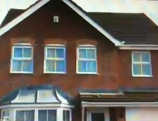
This is the picture after editing...
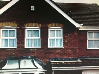
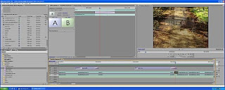
We added different effects to the film using the file ‘video transitions’. One of these effects we used was the cross dissolve. This was used in order make our cuts from one scene to another a lot smoother. We could choose whether we wanted the scenes to overlap a lot or not at all using the A and B icons shown in the picture below.
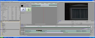
Another effect used was the ‘dip to black’ effect. We used this when zooming in from our establishing shot to the scene of the detective within the room. This was used to represent to the audience that the scene to come (the detective in the room) is occurring in that house. We believed that this cut was very smooth as the dip to black makes it possible to switch from the window to the swinging of the bag in the room. As we did in the cross dissolve we can similarly fade in and out using the A and B icons.
A final effect used was the slow motion clip at the end. This effect was used by reducing the time span on the clip; this therefore produced the slow motion effect. This effect went very well will the non-diegetic music which was slow and intense. This slow motion clip occurs just after Letch kills the detective. This makes the scene daunting and lets the audience take in what has just occurred as they hesitantly watch the well built mobster walk away in slow motion.
Titles
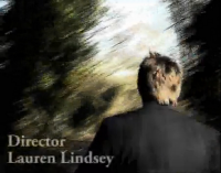
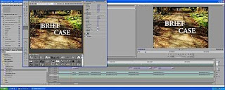
During the opening scene we were meant to include titles such as the film companies, the producer and the director. We used a bold, rough font to portray the rough crime genre of our film. The font used was called Adobe Garamond. We named the film Brief Case, this is a play on words and is a double entendre as the prop of concern is the briefcase, however the killing was done so brutally and quickly it could be called a ‘brief case’. We put the title all in caps lock so that the audience know that is the title of the movie. Due to the fact that we included a lot of walking in our opening sequence we decided to put the titles over the picture rather than on a black screen. I thought this worked really well as the titles were readable and you could still seeing what is going on in the picture. This also meant that we had to colour the titles white in order for the audience to be able to read them. The process in which we edited and applied the titles is shown below.
No comments:
Post a Comment